We’ve already seen this week how risks taken when designing an international jersey can result in an absolute beauty.
Only a few days ago, we were left salivating over the pay-off that came from the re-imagination of Croatia’s kit design via Nike.
PICS: Croatia's new Euro 2016 kit is a thing of beauty… https://t.co/Dg65aXB6NW pic.twitter.com/JFkArfla1a
— JOE (@JOE_co_uk) March 16, 2016
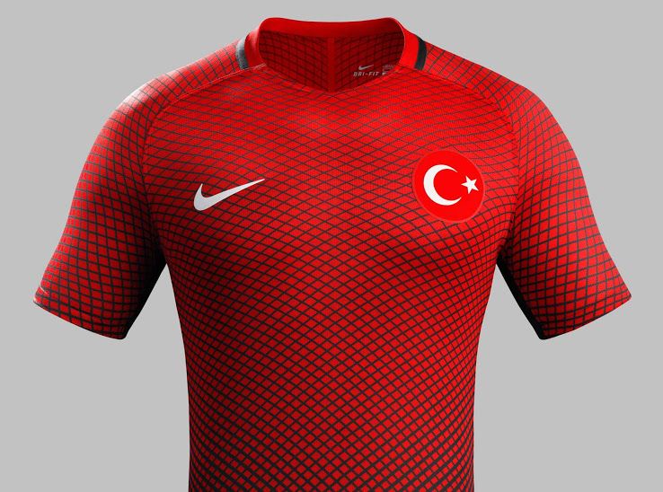
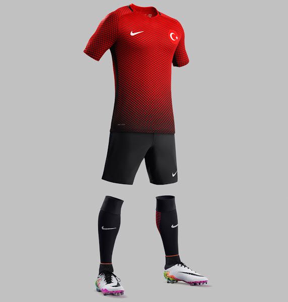
Croatia’s Group D rivals Turkey, too, tried to take a punt with their strips ahead of this summer’s Euro 2016 but, unfortunately, their gamble wasn’t quite as successful.
They seem to have gone for a bizarre web style jersey – not unlike a certain spidey superhero…
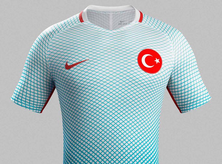
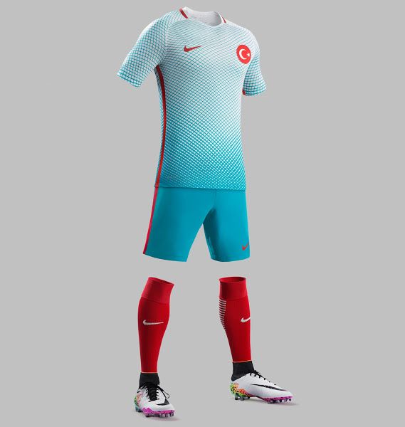
We must admit that the away strip is slightly more appealing with a light blue colour and a fade between jersey and shorts that is a bit smoother than the home kit.
But again, the red socks are too bold to match the jersey and shorts combination? We just don’t get it.


