Norwich City’s kits have always been a little… out there.
The bright yellow and green base colours don’t exactly lend themselves to subtlety, so every year their newest strip becomes the talk of football fans starved of footballing action to discuss.
We’ve seen some pretty creative new shirts this summer – as well as some that underwhelmed – but Norwich’s new offering might be the most divisive of the lot.
Even though the Canaries are back in the Championship this season, they’ve still managed to stay relevant with their new third kit – whose yellow and green splatterings on a white background is either a work of madness or genius, depending on who you ask.
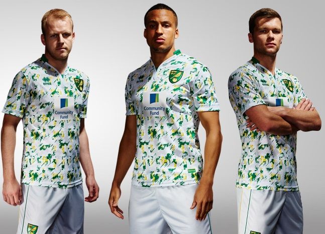
Now some of you might say that the kit looks like something you’d make in art class in year one, or maybe even the covering for a seat on a bus that had been in operation since the ’80s – but some seem to have enjoyed it.
Going to stick my neck out and say I really like this kit pic.twitter.com/0QLuqT2iWI
— Conor Heneghan (@conorheneghan1) July 22, 2016
https://twitter.com/PercyVarco/status/756401491070619648
Love it!
— Chris Oakley (@chrisoakley) July 22, 2016
Yeeeeeees @NorwichCityFC @ErreaOfficial. You're just a few more splashes of paint away from perfection. pic.twitter.com/hCiqoq2XTy
— Mike Wise (@wisey_9) July 22, 2016
https://twitter.com/acpart/status/756419505413296128
Of course, not everyone was so kind…
Bold of Norwich to make a kit from the wallpaper in one of those cafés that has a play area pic.twitter.com/UwIJ2qI4DR
— Tom Victor (@tomvictor) July 22, 2016
Norwich proving that using your third kit for banter purposes is the way forward. https://t.co/03AOhDjfHf
— Daniel Storey (@danielstorey85) July 22, 2016
Robbie Brady needs to make a move quickly to avoid wearing this calamitous new Norwich kit. Oh dear pic.twitter.com/Y0kj9U2LTH
— Kevin Palmer 💙 (@RealKevinPalmer) July 22, 2016
https://twitter.com/ITFC_PlayerArt/status/756416782743793664
@NorwichCityFC @ErreaOfficial pic.twitter.com/BQP8aOg9Ph
— Mike McGuire (@McGuire_Mike) July 22, 2016
https://twitter.com/connoroleary_/status/756399409772888064
Still, we’re not sure exactly when they’ll get the chance to roll it out.
Want to win a free TV or iPad? Enter the draw to win one by taking part in this quick survey.


