Dear readers… it’s time we learnt about something called “kerning”.
Kerning is the practice of organising the space between letters to make text easily readable.
This is normal kerning using a web font. T h i s is me using a wider kerning, which makes the first “is” confusing to read in this sentence. T his is irregular kerning, which makes the word “this” less pleasant to read.
Kerning is a very important skill for typographers and advertisers. It can be the difference between a well-designed piece of work, and something that’s a headache to look at.
(Infamously, the end credits to “Skyfall” have really bad kerning.)
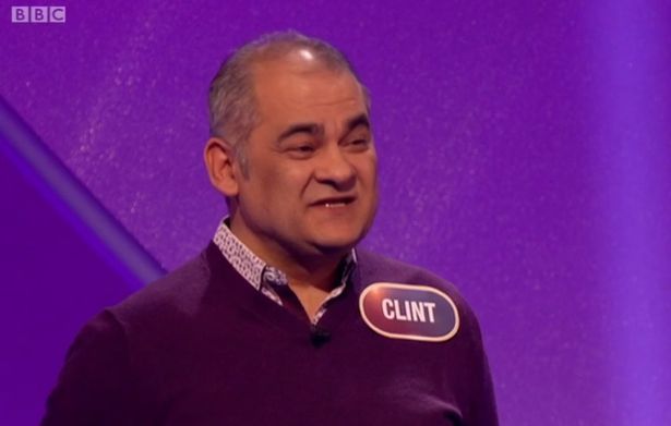
Why are we going on about a niche skill so much? Because on Monday evening, a gentlemen went on “Pointless” and well… look.
That is what happens when you don’t sort your kerning out. A lovely gentleman called Clint turns up on tele with a nametag that looks like… well… y’know.
It didn’t take long for Pointless viewers to start rubbing their eyes in disbelief.
@bbcone #BBCPointless @pointless
Thank goodness I've got my eye test booked for Saturday. I'm sure poor Clint on podium 4 is a lovely guy 😯— ~♡Debbie Lee♡~ (@PinkerbeIl) October 24, 2016
On @TVsPointless the C and L are a bit close together in 'CLINT' #Pointless
— Notts Blade (@Notts_Blade) October 24, 2016
https://twitter.com/JQW/status/790590368748306436
Lovely lovely Clint is a property developer from Surrey, and popped up on the show with his son Colm.
“I have a love of Bruce Springsteen, the England football team and Colm,” he told Richard and Alexander.
We’re really sorry Clint. You seem like a lovely fella. But let’s take this as an exercise in learning proper kerning.
Maybe not the best name to go on #pointless with
#100% #CLINT #C**T😂 pic.twitter.com/oAbzpkIM5a— Colin Archer⚒️🏴🇬🇧 (@Antiguamann) October 24, 2016
Clint's namebadge on #pointless looks a bit iffy from a distance. The space between the L & the I could be slightly larger.
— Mark (@CHRdriver) October 24, 2016
You can catch up on the latest episode of JOE’s Football Friday Live right here…

