Top Of The Pop(pies).
At this time of year, many choose to remember the horrors of war and the sacrifice made by generations of servicemen and women with the quiet dignity of a simple paper poppy pinned to a lapel.
Made and distributed by the Royal British Legion, it is a potent reminder of the contribution of our armed forces, and a vital source of funds for the veterans’ charity.
However, in recently years it has become clear that to many, a simple poppy isn’t enough. In an increasingly politically polarised world, how might we adequately show respect to those who have sacrificed so much?
The answer might be found by looking to our venerated national press, those moral arbiters, for guidance.
You may have noticed that National newspapers have recently began displaying a poppy in their mastheads. But what is the right approach? It is my pleasure to guide you through this moral maze.
DAILY EXPRESS

A characteristically strong showing here from the Daily Express. Having opted for a life-like poppy over a facsimile of the mass-produced paper version, they have correctly positioned the leaf at 11 o’clock – a nod to the time and date of the end of the First World War.
SCORE: 9 respects out of 10
FINANCIAL TIMES

A pitiful effort. I hesitate to even use the word ‘effort’ here, since clearly none has been made. An affront to our brave boys and girls.
SCORE: 0 respects
THE GUARDIAN

Another, perhaps unsurprising, poor effort here. The Guardianistas are showing a clear lack of patriotism.
SCORE: 0 respects
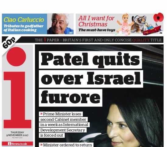
THE i PAPER

I can’t help feeling that ‘i’ have missed a trick here. Replacing the dot of the ‘i’ in their masthead with a poppy would have given them a higher score. As it is, they have opted for a relatively small poppy in the top right-hand corner of their front page. They lose points for the lack of a leaf.
SCORE: 4 respects
DAILY MAIL

A clear, bold poppy with a correctly positioned leaf. Respectfully situated so as not to interfere with the newspaper title or other graphics, the light catching the poppy really draws the reader’s eyes towards it and makes it stand out. Tasteful and elegant.
SCORE: 9 respects
METRO

Wow! The Metro has taken respect to the next level here. They could have replaced the o in Metro with a single poppy, but instead decided to go for a whole wreath. So much respect here. An example to us all.
SCORE: 10 respects
DAILY MIRROR

Whilst the Daily Mirror’s poppy isn’t a big as those of other newspapers, their own tagline ‘FIGHTING FOR YOU’ does offer us a chance to remember what it is that the poppy symbolises. Opting for a life-like poppy, they lose points for the incorrectly positioned leaf.
SCORE: 5 respects
THE NEW EUROPEAN

The youngest national newspaper on the list has decided not to show respect in any way for our armed forces. Not a sniff of a poppy, despite having an o in their name, which could have been replaced with said flower.
SCORE: 0 respects
DAILY STAR

A bold design from the Daily Star. They gain points of highlighting the importance of the poppy by positioning it over their own title, but lose points for then partially obscuring the poppy behind the number 2 in its eagerness to tell its readers how much cheaper than the Sun they are. A further point docked for the lack of a leaf.
SCORE: 4 respects
THE SUN

No leaf here, but the Sun makes up for this by combining the image with a poppy with that of an old pound coin. The point of poppies is, after all, to raise money for armed forces charities and not just to remember stuff.
SCORE: 7 respects
DAILY TELEGRAPH

Like the Daily Mail, the Daily Telegraph has chosen to position its poppy away from other graphics, providing its readers with an unobstructed view of the reverential bloom. The incorrectly positioned leaf leaves a somewhat bitter taste in the mouth, however.
SCORE: 6 respects
THE TIMES

It took me a few minutes to locate the Times’ poppy, such is its size. One can only imagine the editorial decisions that lead to that leaf positioning.
SCORE: 1 respects


