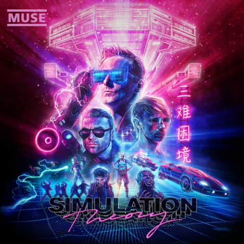
Everyone’s favourite Devon-based space rock three-piece, Muse, are back with new album Simulation Theory, and we really need to talk about that cover art
There are exactly three situations where Muse sound really, really, good
1) Over the montage in the build-up to a major sporting event. 2) On the trailer for a really big, expensive Xbox game. 3) When you are 14 years old.
And in all three of those situations, they sound fucking amazing.
But outside of those, Matt Bellamy and co are kind of like Queen, only if Freddie Mercury took himself really, really seriously, and was well into Elon Musk’s space programme.
Despite probably being something that we should have all grown out of a long time ago, Muse have refined their schtick over the last two decades to become one of Britain’s few genuine stadium-fillers, and modern rock dinosaurs. The sort of band who feel like they have been around forever, and will be around forever. Even after Trump and Kim Jong Un finally bring about the apocalypse, Matt Bellamy will still be there, writing space operas about Vikings on the moons for an arena full of cockroaches.
Muse have long past the point of self-parody. To make a Muse song is pretty simple – write some lyrics about impostor supernovas and technological singularity, sing it in a falsetto voice over an anthemic chorus, add an epic guitar solo and make it at least seven minutes long. Et Viola, sell out Wembley Stadium five nights in a row to an army of engineering students.
We all know the drill by now, and you either love or detest them.
Which brings us to the cover for their eighth studio album Simulation Theory, which was revealed last week. And, seriously, what the fuck?
Somebody really enjoyed the Ghost In The Shell remake.
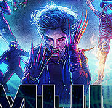
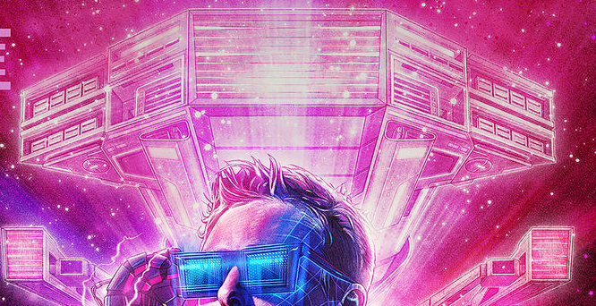
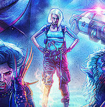
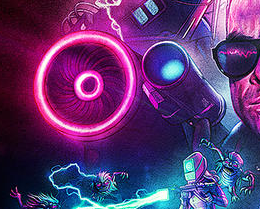
Let’s just list what’s on there:
Neon pink Chinese text.
Electric blue Tron girds.
Both Aviator shade and Back To The Future glasses.
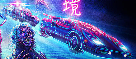
A Lamborghini Countach being chased by a cop car.
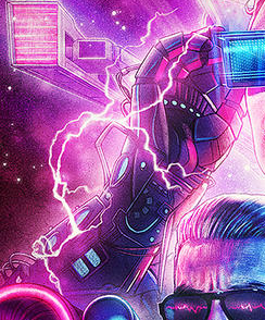
A cybernetic arm.
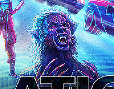
A werewolf.
Edward Scissorhands’ non-union Mexican equivalent.
A spaceship.
Manly stubble.
A smoking babe in Lara Croft cosplay.
It won’t surprise you to learn that the cover was designed by Kyle Lambert, the man behind those memorable Stranger Things posters. Muse have never been one to be trendy or relevant, but damn, isn’t this faux-1980s retro thing just totally played out by now? It’s not just Stranger Things. We’ve had Grindhouse. And Far Cry Blood Dragon. And Kung Fury. And Ready Player One. And the ‘San Junipero’ episode of Black Mirror. And Vice City. And Hobo With A Shotgun. And even Guardians of the Galaxy.
It is just baffling. It just feels like they are aping a trend that has already been flogged to death, chasing an aesthetic that has lost whatever little meaning it had in the first place. Whatever you think of them, Muse have cultivated one of the strongest identities in British music, they don’t need to do this.
Who still thinks this stuff is cool? I mean, we get it. You are old. You still think The Goonies is a good film. You had a ZX Spectrum and still make jokes about Snickers being called ‘Marathon’.
Wake us up when we get the 1990s version of Stranger Things, with The Fresh Prince of Bel-Air references, and art direction based on the Saved By The Bell opening credits, and Hanson on the soundtrack, and people wearing Austin 3:16 shirts. We are so down for that.

