If you think it’s just about the football at Euro 2016, then you’re missing out.
Each major tournament brings along a series of sideshows and bizarre storylines. But more importantly, each major tournament brings with it a new set of kits for us to fawn over.
And this year’s European Championships have more jerseys for us to enjoy than ever before. So for your (and our) pleasure, we’ve ranked all 24 teams’ home shirts from worst to best.
Remember that these rankings are absolutely not the opinion of just one writer, but are in fact the absolute definitive ranking of what’s good and what’s bad. And if you disagree, then you’re wrong.
24. Czech Republic
The Czech government are apparently considering changing the country’s name in order to boost the sales of international kits, but they needn’t bother based on their Euro 2016 efforts.
Their only saving grace is that they are in a group with three other teams who wear red (Spain, Croatia and Turkey) so they might not actually get to inflict this shitshow of a shirt on the general public.
When even the shirt is pointing down, you know you’re in trouble.
23. Albania
Not many people are giving Albania much of a chance at Euro 2016, but in a group alongside a pretty poor Romania team, they could potentially sneak a win and make the second round as one of the best third-place teams.
Considering the fact this is their debut at a major tournament, you might have thought they would go all out and design a kit that will stand the test of time. Unfortunately for any Albanians looking to commemorate the occasion, their kit looks like it has already started to fade in the wash.
22. Turkey
So far, so bad for Group D. Czech Republic’s dead-last finish in our rankings is the only thing that has saved Turkey from finishing bottom of their group.
We get it, there are a lot of red international kits and you feel like you need to do something to stand apart but throwing a load of mesh over your old kit isn’t the answer. Mesh is never the answer.
21. Northern Ireland
Sorry to any Northern Irish readers, but I think you know just how terrible this jersey is. The snot-green and navy blue combo has never exactly been a match made in heaven, but at least we could all appreciate you trying something else.
But what is going on with that blue strip across the chest? Maybe it stands for something deep and meaningful, but we didn’t bother looking it up because it disgusted us too much.
20. Switzerland
There’s very little to like about this kit, even if the badge is a big plus. We need to petition kit-makers to stop using different shades of the same colour and just making one of the shades shiny as a tactic for designing shirts.
It looks like a subtle advertisement for The Chase. Wonder how many of their games are on ITV…
19. Slovakia
There’s not a whole lot wrong with this one, but there’s not exactly a lot going on either.
A bit like that acquaintance you have who is perfectly inoffensive but utterly boring too. You’ve no problem hanging out with them in a group setting but you’d rather fake your own death than be left alone with them.
18. Austria
Seriously guys, you can’t just make a shirt red and call it a day. The white shoulders are a nice touch, but then the over-designed red stripes on red stripes motif is just too much.
Austria are many pundits’ dark horses for the tournament but they’ll need to do better than this.
17. Wales
It’s getting a little tiresome, but we just can’t figure out why international kit-makers have so much trouble with the colour red.
You could argue that this one is a throwback, though it comes across as a lack of effort. There’s nothing about this shirt that makes you think it’s worthy of an international tournament. Yet another training top masquerading as the real thing.
16. Poland
Poland boast a team with remarkable flair and talent, not that you’d notice that based on their kit for Euro 2016.
While the top half is simple and elegant, the rising grey stripes just scream “intern who just discovered InDesign”.
15. Sweden
Not even Zlatan Ibrahimovic is safe from the shiny stripes of the same colour phenomenon currently plaguing the international kit scene.
In a tournament with (spoiler alert) three teams sporting yellow and blue kits, the usually stylish Swedes come off looking the worst.
14. Russia
I’m not sure this one really works, but it gets extra marks for being different.
It’s a solid effort though, and begins our transition into the good section.
13. Germany
This might be controversial but Germany’s kit is pretty average. It makes sense that it would be ranked around the middle.
There’s not much to be excited about a black and white shirt, unless you still don’t own a colour TV and are sick of not knowing who is playing when you go to matches.
A classic look that should perhaps be updated for the World Champions.
12. Italy
Italy has a long history of fashion, which has generally extended to the world of sport too. Throughout the years, the Azzurri have been the style icons that the rest of us follow.
It makes it a little disappointing to see them so low down on this list then. History may end up looking back on this one more fondly, but it’s just not working in the here and now.
11. Ukraine
It’s not often you see a button up collar anymore. So even though it looks a little like a picnic blanket, we applaud this effort from Ukraine.
They may end up being knocked out by Northern Ireland, but they’ll look above average while doing it.
10. Hungary
And so begins the “so close to being great but also so close to being completely shit” section.
Not many are backing Hungary to do much of anything, but their dark red strip will make them easy on the eye, even if their play isn’t.
9. England
We’ve already seen that there’s not a whole lot you can do with a white strip, but this is a pretty decent effort.
Sure it has the feel of your tinder profile about it – in that it looks better on a screen than it does in real life – but we still think it’s not too bad.
8. France
The hosts of Euro 2016 have displayed the correct way to mix light and dark versions of the same colour, although the fact that blue lends itself rather well to doing that gives them an advantage.
That said, it’s still missing that va-va-voom of previous years.
7. Spain
The defending European champs come in at a respectable seventh on this list. Not because of any particularly impressive showing on their part, but because of the dearth of legitimate competition on the international scene.
That said, their reputation can only take them so far. Once again, a country renowned for their top-class kits fall just short of greatness.
6. Romania
They’re not expected to do much this summer, but we’re big fans of this effort from Romania.
There’s something about the yellow/red/blue combination that just works. We just love those primary colours.
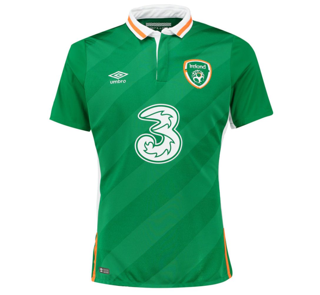
5. Republic of Ireland
This ranking comes with a rather large, 3-shaped caveat that we’re attempting to rank this kit without its sponsor. While the boys in green will not actually be carrying the advert on their shirts this summer, you don’t seem to be able to pick one up for yourself with the giant 3 on the front.
Still, you might as well go all-in and just get Ciaran Clark’s name printed on the back alongside another 3.
Besides that fact, this is a fairly tidy kit. Fun fact: the diagonal markings on this shirt make it look like a football pitch, which is what most of Ireland’s matches are played on.
4. Iceland
For an international debut, this is a very impressive design from up north. Originality will get you very far in these rankings, and we think Errea have done a bang-up job here.
Blue, white and red is another colour combination that works very well.
3. Portugal
Can everyone please take note of how to do a red football kit? Sure, it’s just the same as France’s but with red instead of blue, but goddammit it works.
Also, for reasons we have never understood, the Portuguese crest just always adds an extra dimension of class to any shirt.
2. Belgium
Everyone here at JOE wholeheartedly backs Belgium’s transition to an entirely black kit. One of the reasons why they have become every football hipster’s favourite international team have been the quality of their kits.
It might not make much sense for the Red Devils to go all-black but we don’t really care. This is just a glimpse of what could be.
1. Croatia
It was only ever going to be them, wasn’t it? Croatia have arguably the best kit in world football, and have done for a very long time.
The only worry is that Croatia are n Group D, alongside fellow red-shirters Spain, Czech Republic and Turkey. We’ve checked (pun not intended), and the Croats are the designated away team against both the Czechs and Turkey. You may remember those two as the worst (Czech Republic) and third worst (Turkey) shirts on our list.
Uefa will have a lot to answer for if Croatia are denied the right to wear the best shirt in the competition in favour of two of the worst.


