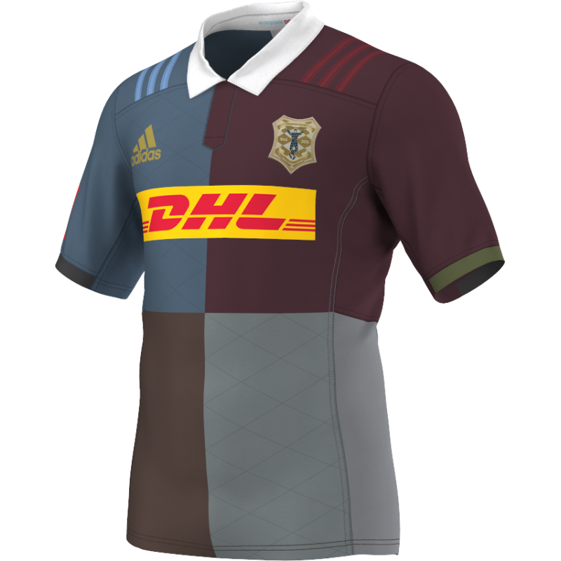
You can’t really go wrong with a Harlequins kit but, for 2016/17, they have produced a shirt that is so, so right.
The jesters of West London have always delighted us with their multi-coloured ensemble, but this season sees them go a step beyond their usual offering.
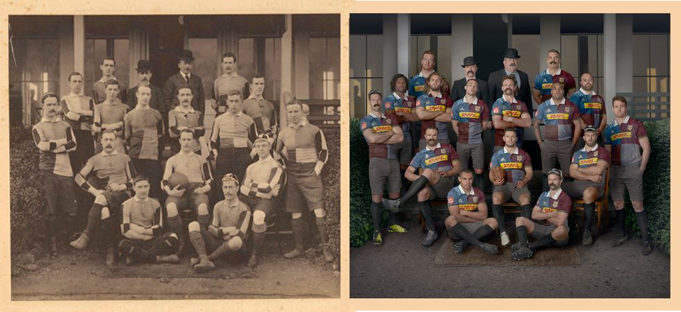
The upcoming season for Quins is their 150th since their founding in 1866 and they have produced a new home shirt that is a nod to their very first piece of kit. With a modern twist, of course.
150 years in the making. The new @QuinsRugbyUnion home shirt. #Harlequins150 pic.twitter.com/ro8r4jWeT3
— adidas UK (@adidasUK) July 1, 2016
The original, muted colours are augmented by a bold sponsors logo and Adidas markings. In case you hadn’t guess by now, we’re big fans of it all.
And, of course, it wouldn’t be an old-school rugby kit without a proper collar. Just look at that thing. It looks like something your granddad would wear as it slowly got heavier under the weight of all the mud and rain.

To ram home the vintage message, Quins organised a photoshoot which involved two gentlemen in pin-striped suits and bowler hats – and some fake moustaches – posing with the senior squad.
We have to say, we’ll be massively disappointed if they don’t line out in the same shorts and socks combo, just to go all 1866 on it.

As for the away jersey, well, they went nuts, making it as modern as possible.
Harlequins new 2016/17 away shirt. A nod to the future in a year we celebrate our past #Harlequins150 pic.twitter.com/ZcWM73khgq
— Harlequins 🃏 (@Harlequins) July 1, 2016
Home, good. Away, nay.


