With the news that Man City are changing their club badge after a fan consultation period, we asked the internet to mock up some alternatives.
The results are…incredible, for all sorts of reasons. With no disrespect to the artists concerned, we feel that most of these fall into the ‘so bad they’re good’ category.
And we suspect that a large number of the contributors are perhaps Mancunians of the red persuasion. Judge for yourself with our Tony Hart style gallery…
Tayler Willson created this effort, capturing the zeitgeist of the emoji age…

Scott Jones suggested the City slogan ‘Manchester is blue’ had some merit…

Stuart Tomlin frankly wasn’t trying…

Dan Bamber referenced the source of the club’s recent success…

As did Andy Jones…

As did Jonny Utah…

As did JC…
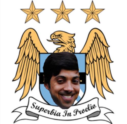
There’s a pattern here (Tom)…

Alex Whitecross suggested City were still living in Man United’s shadow and lampooned their ‘decorative’ stars…

Mohsin Arain had fond memories of a certain City alumnus…

Predaluck was just plain rude…

Samatar Mumin suggested City were something of one-man team…

And Dave was thinking along the same lines…

Finally, Col Robinson referenced the sheer massiveness of the club…


