Gene Hunt, eat your heart out.
We know there’s a revival of all things 1980s, from the cultural phenomenon that is Stranger Things, to the popularity of synth music with decidedly retro stylings. But let’s have it right, the eighties really were the decade that fashion forgot.
Everything was brash, in your face, and completely lacking in any sense of subtlety. So, of course Manchester United are going to borrow the look and feel of the Ron Atkinson years to inform the look of their home kit for next season.

Just before Christmas, we brought you the news that United had unveiled a brand new home via their Twitter account, although in fairness that monstrosity was purely to be worn virtually on FIFA.
Only in #FIFA18 Ultimate Team. Our first ever digital fourth kit. https://t.co/2kYvWgftzE #FUT @easportsfifa pic.twitter.com/XK5HWP4cBL
— Manchester United (@ManUtd) December 18, 2017
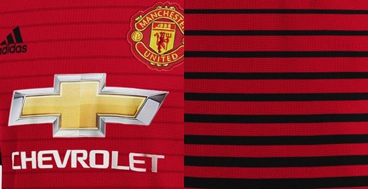
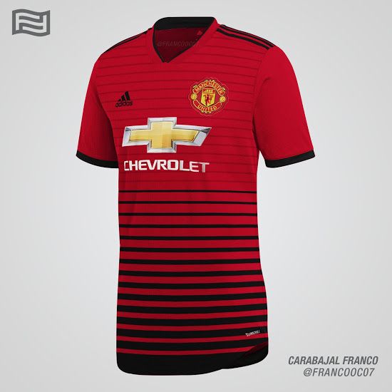
But the next real life version is possibly even worse. Taking the very eighties style of black and red together in a gradient of increasingly thick stripes – like your dad’s old office wallpaper – they’ve gone full Duran Duran with the 2018/19 vintage.
We have known for some time that the kit will feature a lot more black than is usually the case, and will pay tribute to the ‘the railway men that formed the club’.

Footy Headlines, who are always shit hot at the latest new kits/rumours have shared some images of how the new kit is expected to look, courtesy of designer Franco Carabajal. As you can see it’s decidedly retro in the wrong ways…
