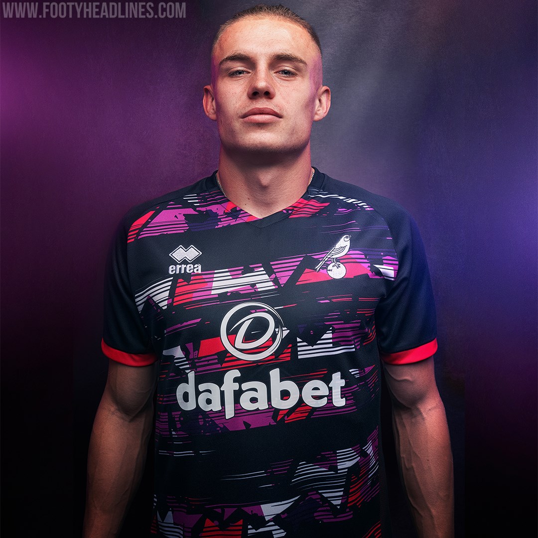
Pretty in pink?
Fair play to Norwich City’s kit designers. After years and years of having to think up numerous different variations on the green and yellow home kit, they’ve gone full throttle with the club’s new third kit. Unbound by the constraints of the Canaries’ standard colour palette, they’ve produced something truly unique with this new neon number. And by ‘unique’ we mean it looks like the Pink Panther vomited all over a polyester t-shirt.
In fairness to Errea, Norwich’s kit manufacturers, the overall design is not displeasing. Yes it’s bold, yes it’s something of an assault on the senses, but isn’t that what third kits are for? To experiment with daring patterns and appeal to a younger fanbase? The shirt combines various shades of fuchsia, white and purple in erratic intersecting shapes which symbolise flair and motion. And we’re guessing the kids will love it.


