The Netflix screen that you are so used to is no more.
Netflix has changed the way we watch television.
Gone are the days of waiting a week for the next episode of your favourite show to be released. Now we watch what we want, when we want.
There are one or two exceptions that stick to the traditional weekly episode structure, but more often than not, you can just binge watch an entire season of a show in a matter of days.
We have gotten quite used to the ins and outs of Netflix as a result.
We’re used to the home screen. We’re used to the options that are available for us to watch. And we’re definitely used to it asking us if we’re still watching after our fifth episode of Suits in a row. Of course, we’re still watching.
We’re always still watching.
But what we’re used to is about to change.
Netflix has unveiled a new design that will begin rolling out to members all over the world today.
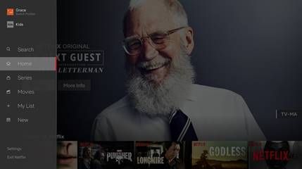
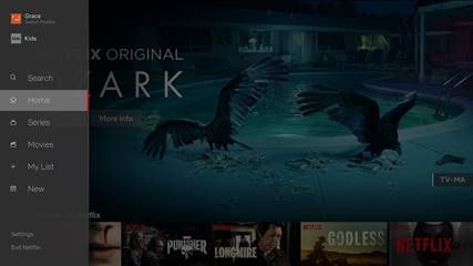
The new interface is based on research and testing around how the streaming site can make it easier to find titles on TVs, which sounds like good news to us.
The new design intends to make the experience of watching Netflix simpler and more natural.
It’s now easier to search and view new content, and also simpler to start browsing with either a series or movie, rather than both being lumped in together in your searches.
That seems like an obvious change to make.
Now, all we need is for them to upload the entire six seasons of Lost and we’ll be happy forever.


