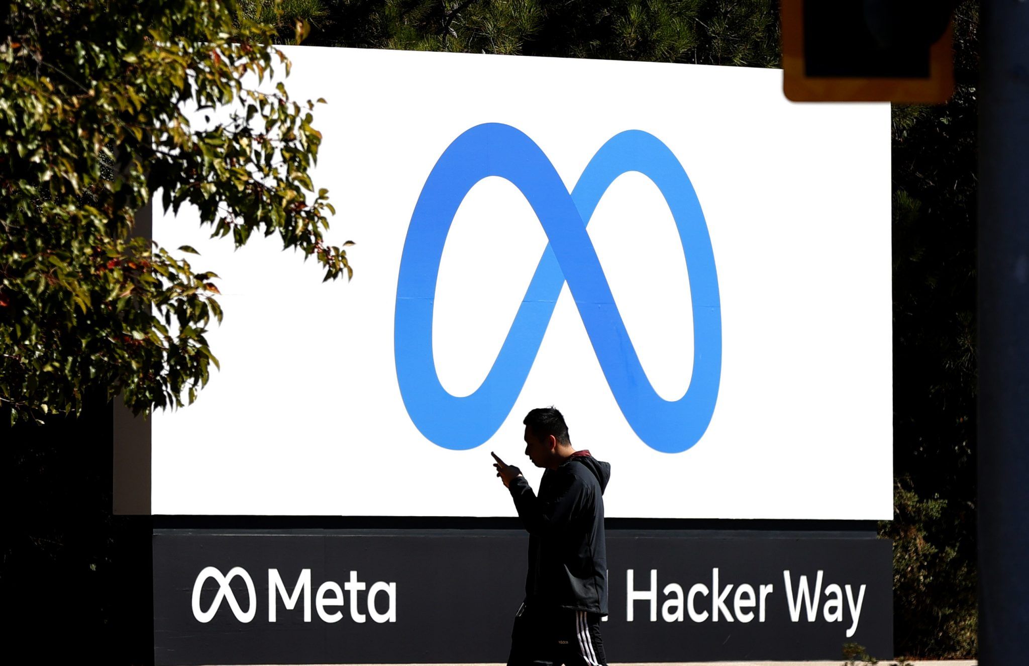
Facebook – sorry, Meta, has officially changed the logo of its wider company from the infamous ‘thumbs up’ to a new, sleek design.
The thumbs up is so synonymous with the Facebook brand, it’s no surprise the company decided to change the logo along with the name to usher in their new era focused on the ‘metaverse’.
The logo has resulted in quite the reaction online, with people saying it looks like a pretzel, turning it into a penis, and even saying they look to have copied an old Microsoft logo.
Facebook officially announced the name change of its wider business last night as part of a major rebrand.
In a letter to investors, Meta CEO Mark Zuckerberg wrote: “I used to study Classics, and the word ‘meta’ comes from the Greek word meaning ‘beyond,’
“For me, it symbolizes that there is always more to build, and there is always a next chapter to the story.”
The company said the name would better “encompass” what they stand for and what the company does, as it expands its goals beyond the world of social media and into projects like VR.

The change will not apply to the individual platforms owned by the company, such as Facebook, Instagram and Whatsapp, just the umbrella company.
The move follows a series of negative stories about Facebook, and wider discussion about the impact of the platform on a variety of issues such as public health and wider discourse.
Related links
Facebook has officially changed its name to Meta
The Facebook, Instagram and WhatsApp crash explained
Mark Zuckerberg’s net worth tanked after Facebook and Instagram shortage


