A lot can be said with a football club’s badge
Few things in football have evolved over the last century as much as club’s badges. Once upon a time, all badges were a Pick n’ Mix of local references, with coats of arms and little details nodding to the community.
Some badges are still like that, of course, but in the Premier League specifically, where the global nature of football is killing the connection between clubs and their local communities allowing clubs the opportunity to sell themselves to a wider audience, the new trend is simplicity.
Once beautiful and classic badges have been overhauled in the name of modernity, and are – as a result – now shit. With that in mind, we’ve decided to once again rank all the badges in the Premier League.
Here’s last year’s ranking. You’d assume the ranking would be broadly the same order, but 2019 was a different time. We didn’t know coronavirus was, we didn’t realise how much one person can eat in a day while socially distancing, and in truth we were more innocent.
So here’s this year’s. Don’t @ us. Or actually do. The engagement is good.
20th – West Ham United
From the lofty position of 18th to rock bottom this year, this will not be good reading for West Ham United fans. Although, not much is good reading for them at the moment. Like all the worst club badges, this one looks like it was created by a 12-year-old using MS Paint in 1997.
From the shape of the outside crest to the emoji-looking hammers, this badge is the exception that proves the rule of ‘Less is more’. Because sometimes, more is actually more.
19th – Brighton and Hove Albion
This just looks like a road sign. Plain and simple. A road sign for seagulls, for some reason. Once you realise that it’s hard to see it as anything else. Poor effort.
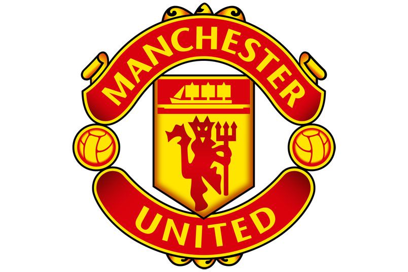
18th – Manchester United
I’m going to state this now before I receive any accusations like ‘Lol a Liverpool fan wrote this’: I am a Manchester United fan. But the club’s badge isn’t good. The old crest – which contained the actual words “Football Club” on the bottom – was very nice. But this is just too simple, and the font far looks like something you’d use on a presentation in secondary school. Not good enough.
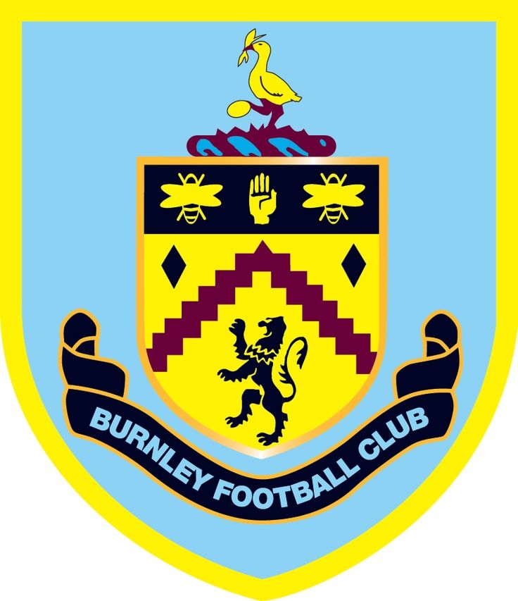
17th – Burnley
I cannot, and will not, get past the fact that the Burnley badge looks like a particularly intricate Super Mario level.
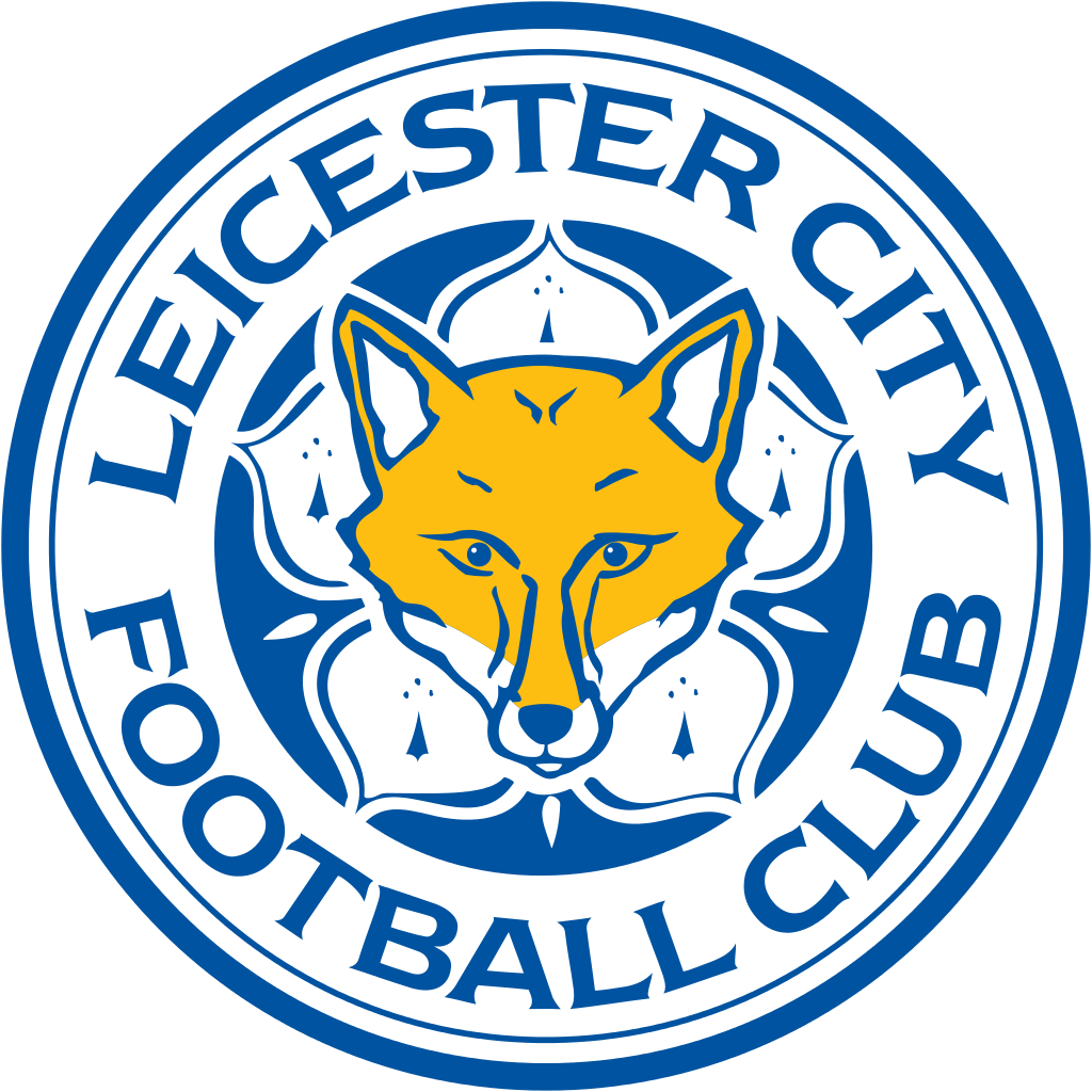
16th – Leicester City
This badge isn’t inherently bad, but it’s hard to look beyond the fact that this looks like the face of a fox which is quickly watching its life flash before its eyes as a Range Rover bears down upon it. Not for me, Clive.
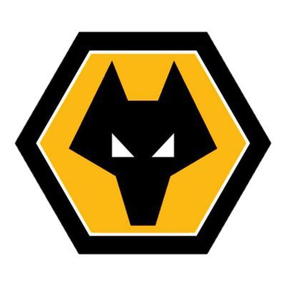
15th – Wolverhampton Wanderers
It will not be a surprise to hear that there was a recent legal dispute over the Wolves’ badge. This was because pensioner Peter Davies claims to have created it as a schoolboy for an art competition in the 1960s. The club disputes this assertion, but the fact that a badge could be mistaken for the scribblings of a child really says it all.
14th – Manchester City
As my colleague Kyle said during last season’s ranking, this badge is just too slick. Does it look appealing to the eye? Yes, but so do a lot of awful things. Cactuses are quite pretty plants. But they’ll fuck you up.
This badge, in all honesty, looks like it’d be more at home as the logo for a members’ club and gym. It’s on all the napkins, above the reception, on the glasses from which you drink an obnoxious amount of the complimentary orange juice. It is not a football badge.
13th – Arsenal
This placement may seem harsh, but hear me out. When Arsenal changed their crest in the early 2000s it was really well received. It was a modern take on their previously beautiful (if cluttered) badge, but unfortunately it would seem it was too nice.
I can’t say this with any scientific certainty, but since the club debuted this badge, the shape used for it has become so ubiquitous with badge redesigns. Look at every league in the world, and almost every redesigned badge you see is in this shape.
As a result, this now looks a bit outdated and run of the mill.
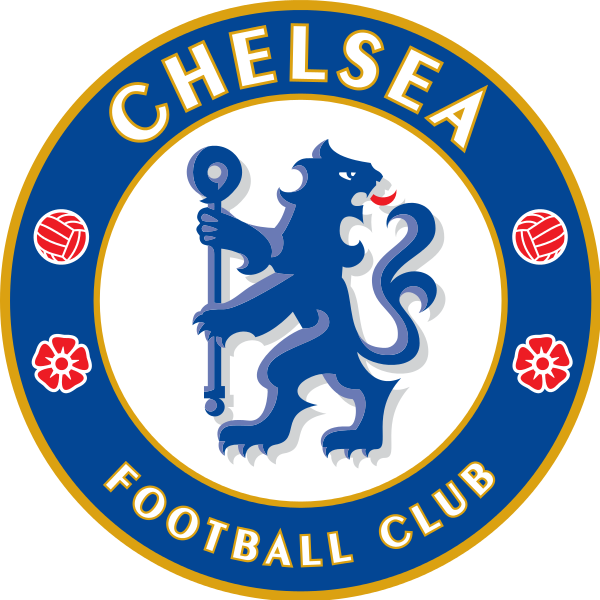
12th – Chelsea
Similar to Arsenal’s, this badge was kinda cool when it first was introduced. For me at least, it gives me fond nostalgic memories of playing whatever Pro Evo game John Terry was on the cover for.
But over time it hasn’t aged well, and it’s hard to not be a little put off by the weird bipedal lion gallivanting while cursing someone behind him for not adhering to a two-metre distance.
11th – Fulham
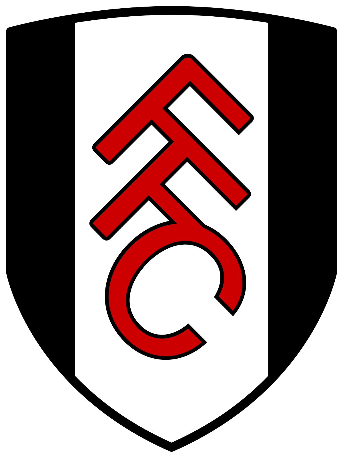
I’m not gonna lie to you: I don’t know what I think about this badge. It is black and white, and features three letters. My brain doesn’t fully recognise it as anything, but maybe that’s my issue. Nonetheless I have to place it in the Nether Zone of 11th. Let’s move on.
10th – Tottenham Hotspur
If you like modern badges, you’ll probably be a fan of the Spurs badge. It’s clean, works in a variety of colours on away shirts, and is also kind of unusual. But if you don’t like modern badges, then all of those things will be the reason for that. I, personally, am a bit ambivalent on this. Apart from the font, which I think is very bad.
9th – West Bromwich Albion

Theoretically this one should be lower, based off my own criteria if nothing else. It has a fairly default shape and the font isn’t inventive in anyway, but the inclusion of this absolutely buzzing little bird on top of the green leaves and red berries just adds something to it.
The addition of a brown detail in badges is underrated – see Atletico Madrid’s badge before their own redesign – and this one is no different. A truly pleasant badge.
8th – Aston Villa
Another exception that proves the rule that modern badges are crap, this reimagining of Villa’s old badge actually benefits from its simplicity. The colour scheme is beautiful, and the little star for their European Cup victory ensures that there’s no needless empty space inside.
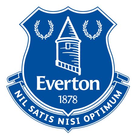
7th – Everton
This is an interesting badge. You may look at it and go ‘that’s exactly the same as their old badge? What was the point of them changing it?’ and well, yeah, you’ve got a point.
But there’s a reason for that. And that’s because Everton did redesign their old badge, but it ended up with the one in the middle below. Yep. That. That badge that looks like it was sent by a designer who’d fallen asleep halfway through work and was told at 5pm that the club wanted to see the final version.
So they changed it to a badge which is akin to moving the furniture about in your sitting room just so it feels a little fresh. But you know what? It does feel fresh. So all’s well that ends well.

6th – Sheffield United
Two blades. The Yorkshire rose. I would quite happily go to war with this badge sewed into my uniform. This is what it inspires the thought of: battle. What more do you want from a badge?
5th – Liverpool
The Liverpool badge is incredibly underrated. Maybe it’s because we are all so used to it, but take a step back for a moment – I’ll wait while you do so, no rush. Ready? Cool – and just have a look at it. Look at each element. Look at the choice of colour. Look at the fonts used.
This is really a brilliant badge. There are no negative elements to it at all. Just great work all round.
4th – Crystal Palace
The Palace badge came out on top last year and for good reason: it has a giant eagle attempting to pry a red football away from the clutches of the Crystal Palace. It looks like something from a Godzilla movie and has one of the most aesthetically pleasing shapes out of all the badges on this list.
Maybe next season this one will be back on top (really it depends entirely on who’s writing the next list) but for now it’s Badge Champions League qualification.
3rd – Southampton
The Southampton badge shouldn’t work. It looks like it’s been cobbled together from various elements of Clip Art. Flower? Check. River? Check. Tree? Check. Scarf? Check? Football? Check. Halo? Check.
It should be a monstrosity but it works so bloody well that I cannot quite wrap my head around it. It’s the football equivalent of throwing everything you have in the cupboard into a pot, stirring it for a while, and coming out with a strangely delicious meal.
2nd – Newcastle United
It’s got a crest. It’s got a turret. It’s got a lion holding a flag. It’s got two seahorses in the middle of a staring contest for some reason. Newcastle United’s badge is about as weird as you can get but it all just fucking works for absolutely no common sense reason at all.
1st – Leeds United

Look, it is great to see Leeds United back in the Premier League. They are a proper top flight club – despite being absent for 16 years – and have a badge that has the perfect combination of slick design and traditional elements.
This badge was introduced in 1998, and it continues to look great. Congratulations to Marcelo Bielsa’s side for securing silverware before the season has even begun.


