No zebras were harmed in the making of this Manchester United shirt
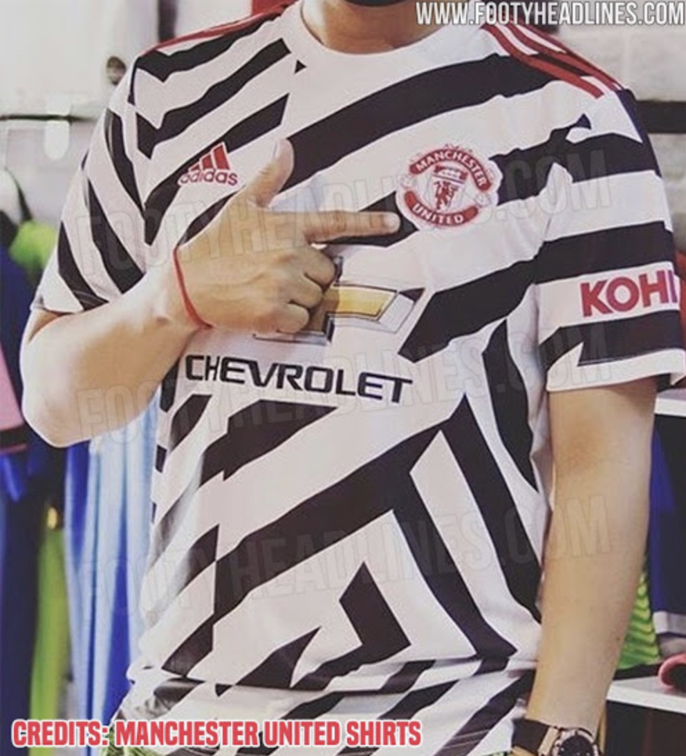
Images of Manchester United’s third for the 2020/21 season have leaked and I’m sorry to announce that it’s absolutely hideous.
Firstly, it’s black and white. Not white with black trim or vice versa, properly black and white. Except, they’re not stripes, nor are they hoops. It’s a complete mish-mash of straight and diagonal lines more akin to a Juventus training top than a United shirt.
The good people of footyheadlines.com have published the leaked images, which you can see below.
At least the club crest is red, I suppose.
Assuming Manchester United fans think it’s as ugly as I do, they will see this as a disappointment following the release of their rather slick and stylish home and away shirts.
The home one might have a pattern more often seen on an inner-city bus, but it’s hardly detectable from a distance and still looks smart. The subtle detail on the black away kit, which was given its first outing against Sevilla in the Europa League, also has a subtle smartness to it.
This, though, looks like a child drew a zebra and put a United badge on it. And not even a talented child.

