It’s kit szn baby
I was going to say it’s that time of year when all the new kits for next season start coming out. Then I realised it’s not, they’ve normally all been announced by now. The past few months have completely thrown my mental calendar and I often forget what month it is. But nevertheless, it is kit season. Clubs have started launching their new kits for next season and as always, some of them are grotesque, and some of them are beautiful. Most of them are, you know, fine.
Here are 10 of the nicest kit releases so far, in no particular order.
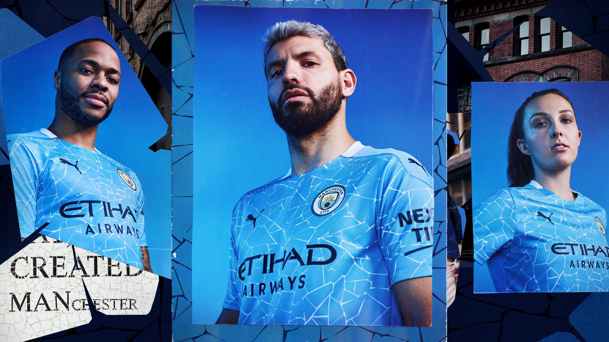
10. Manchester City
This sort of cracked design feature is usually reserved for tabloid back pages when a club is going through a crisis. Boardroom trouble, captains publicly calling out their manager’s shit tactics, that sort of thing. But not here. while City have had their squabbles with UEFA of late, they are very much back in the big time. They’ve secured Champions League football and they’ve got a kit to match it. It’s weird, sure, but how many variations of “a light blue shirt” can you do before jazzing it up a bit?
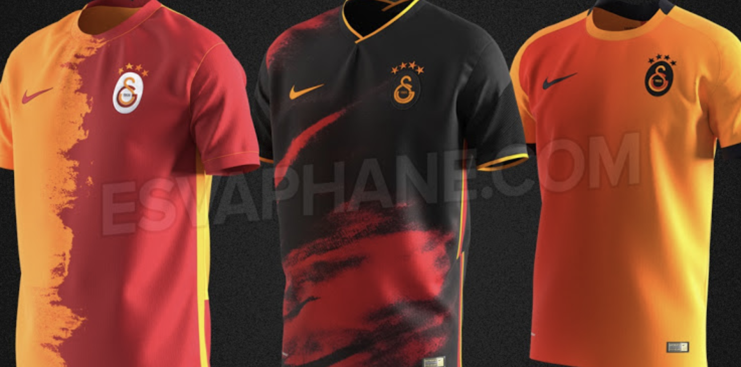
9. Galatasaray (leak)
Now this one isn’t official, it’s a leak. But it’s absolutely stunning. I can’t decide which of these is this nicest. The home kit is clean, not too busy but also very exciting. Black away kits are always cool, this one no exception. And the third kit. Well, given the colours are identical to the home kit, it does somewhat defeat the point of its existence. It would be much better suited to being a training shirt.
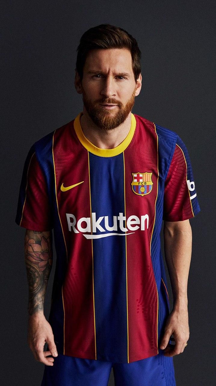
8. FC Barcelona
I was never in favour of Barcelona ditching stripes for squares, if I’m honest. The shirt itself is nice enough but it felt like betraying a core principle of the club. Més que un club my arse. I didn’t like when they went to hoops around 2015 either. So it’s great to see they’ve returned to their roots with this new number. Nike have kept it simple and the results are magnificent. This shirt is like the 2010/11 shirt and the 2014/15 shirt had a baby. Notably, both seasons they won the Champions League…
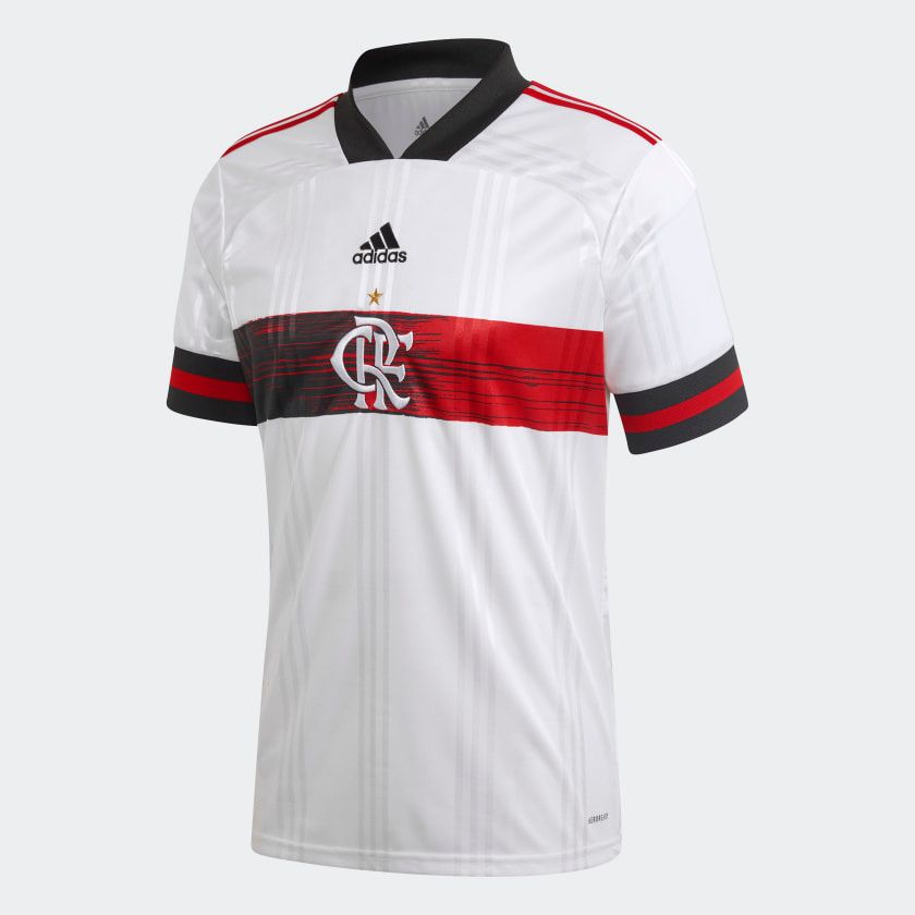
7. Flamengo Away
We now go south to Brazil where Flamengo – great club, great people – have released this majestic away shirt made by adidas. It ticks every box, doesn’t it? It retains the colours of the home shirt while looking different enough. It’s got both badges in the middle. And we all know you can’t beat a central badge on a football kit. The banner across the middle is subtle but not boring. Stripes on the shoulders and those lovely rings at the bottom of the sleeves.
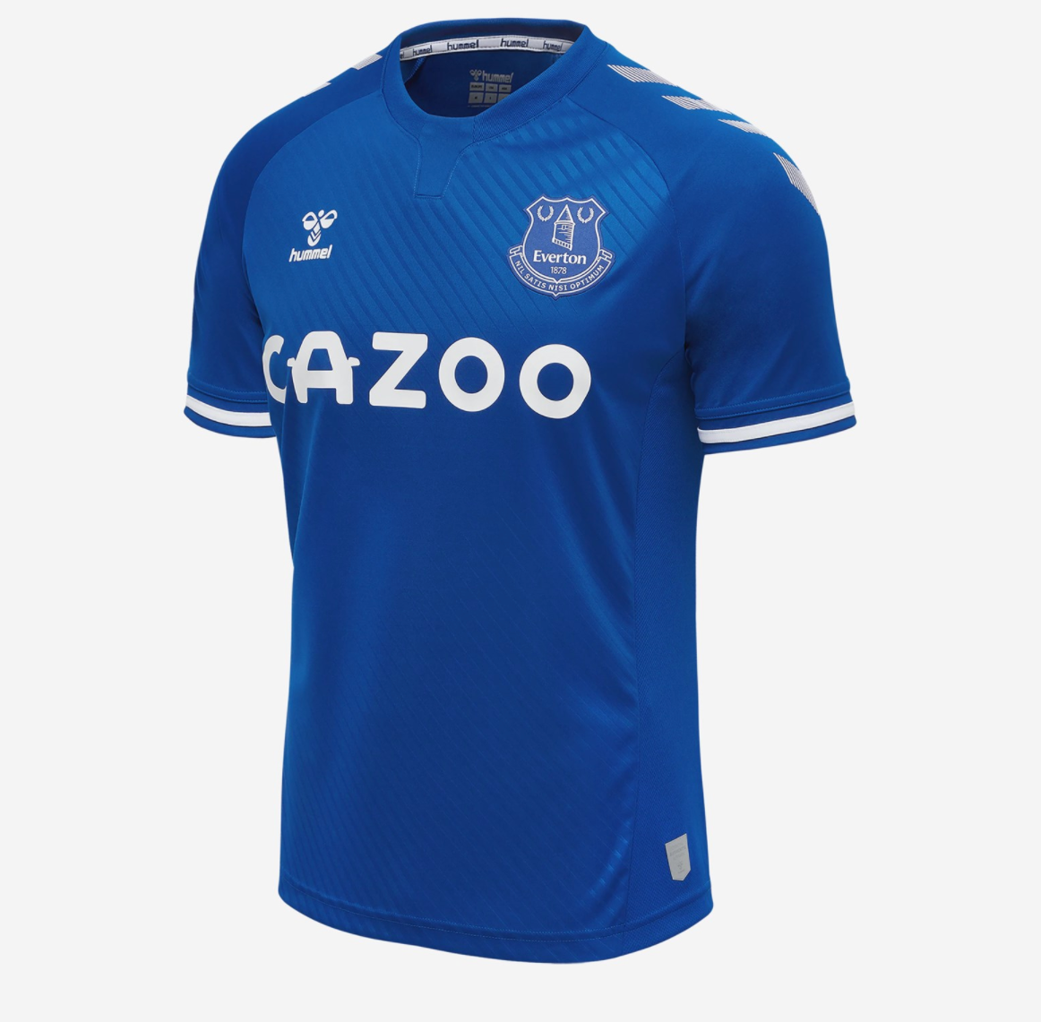
6. Everton
I’m going to go out on a limb here and say Hummel make the best kits. It’s a scandal that they are considered a fringe manufacturer when it comes to football kits and not leading the way. Those arrows (do they have another name?) shit all over stripes or whatever Puma have. I mean look at this Everton jersey. Even the new sponsor fits in perfectly. Nice subtle rings on the sleeves too. Boss tha’.
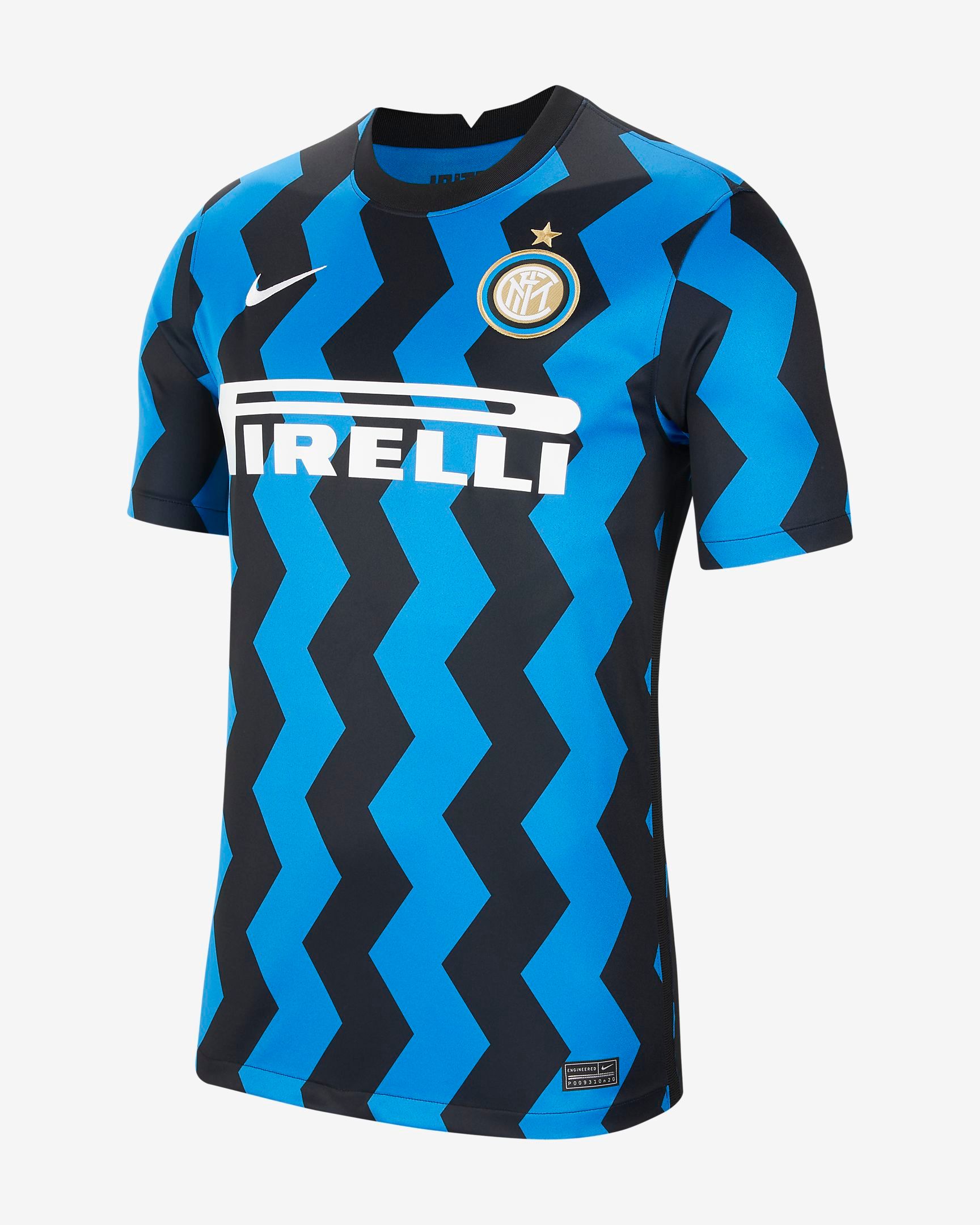
5. Inter Milan
This one is going to divide opinion. The zig-zags are a lot on the eye. But the absence of any other complicated features on the shirt justify it, I reckon. Hopefully Manchester United’s deadwood can dazzle opponents in it next season and finally end Juventus’ monopoly.
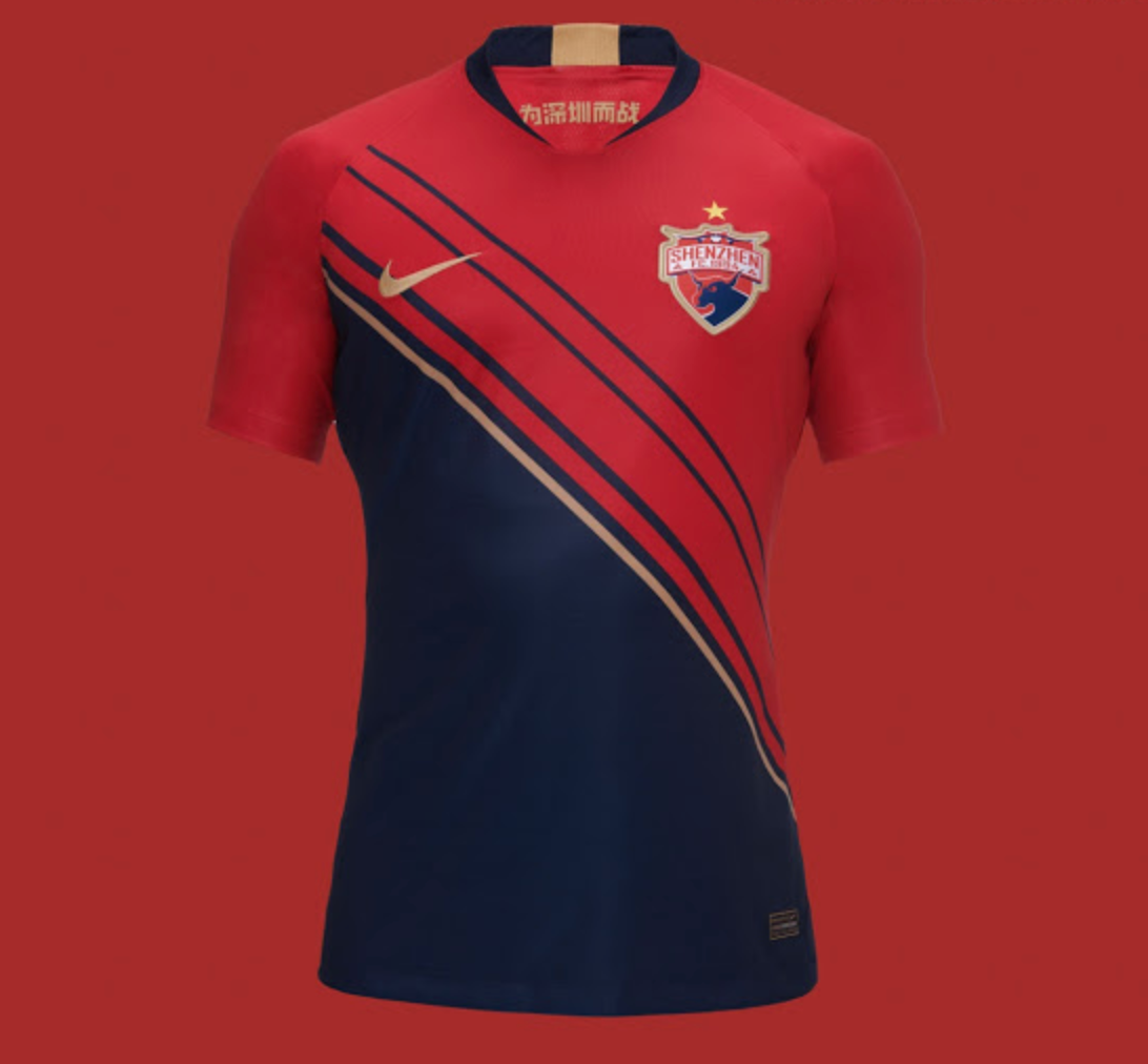
4. Shenzhen FC
That’s right, a CSL team. One of my favourite kit features is the sash, or failing that, a diagonal half-and-half divide. Shout out to Monaco. Nike have opted for that on next season’s Shenzhen jersey and it works a charm. The warm red and blue colours mean it’s not overly loud and the gold trim adds that element of prestige. I have no idea how good they are, though. Could be useless. Doesn’t matter right now.
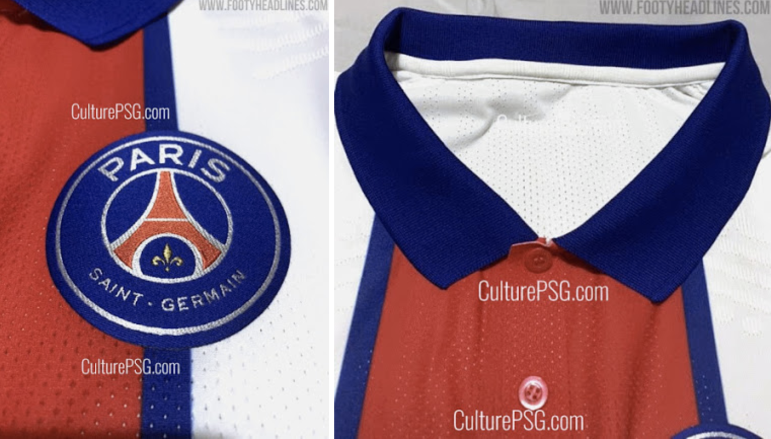
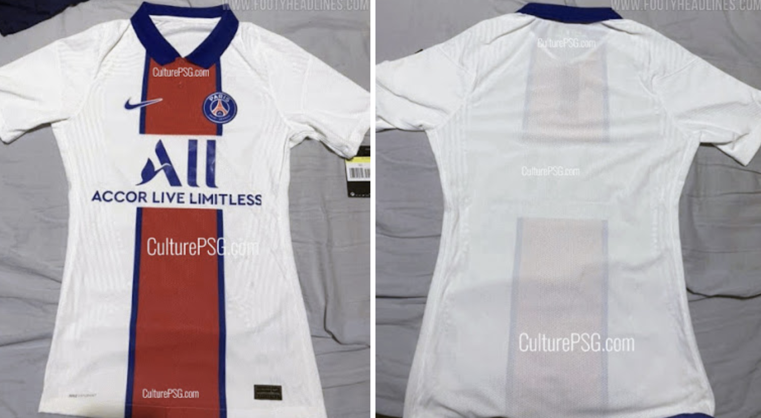
3. PSG Away (leak)
Paris Saint-Germain might be stuck in an eternal cycle of domestic dominance and continental failure but if there’s one European competition they wouldn’t struggle to win, it would be called: Who has the nicest kit?
Red, white and blue is a classic colourway, and their traditional stripe down the middle has made for some gorgeous home kits over the years. But next season’s away kit is the perfect reversal of that design. A white base, decorated with a thick, red stripe down the middle, with thin blue outline, it’s smart, Parisian and the sort of thing sure to be seen at Power Leagues across the country. The leaked pictures come from footyheadlines.com.
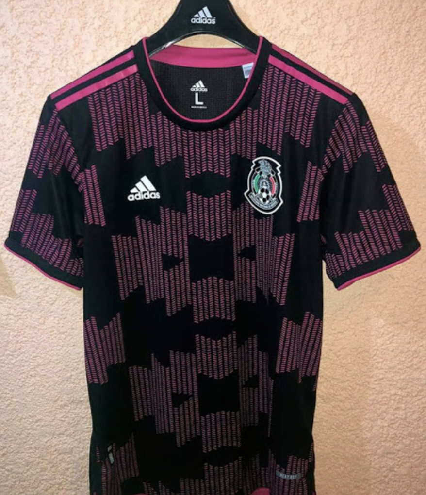
2. Mexico
Straying away from club football here to highlight this leaked Mexico shirt. Mexico have always had bold, outrageous jerseys, and this one harnesses that energy in the best way possible. Look at it. You could wear this to five-a-side, Notting Hill Carnival and a neon paint themed party. Big Inter Miami vibes too, where there is presumably a big Mexican fanbase. I wonder if there’s any synergy in the thinking there.
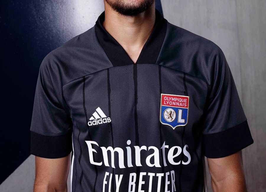
1. Lyon Away
What is it about away kits that makes them almost always preferable to home kits? Maybe it’s the novelty of them not being worn as often. Designers have more freedom with away shirts too, less shackled by tradition. Sometimes, all you have to do to design a good away shirt is take the template, make it black, and ta-da: you’ve got yourself into a listicle about the top ten new kit releases. Fair play. It works.

