Thanks I hate it
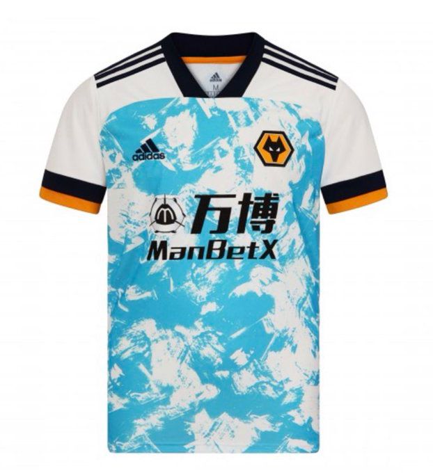
Wolves have released their away kit for the upcoming 2020/21 season. It’s horrible.
I’m honestly struggling to find the words to articulate just how much of an eyesore this jersey is. But here goes.
Firstly, the colours are a mess. White with black and amber (is it officially amber?) trim makes perfect sense for a Wolves away kit. You can tell it’s them, but it’s not going to clash at all with the home shirt. Nice. Good start.
But we need to talk about this blue. The pattern itself isn’t inherently offensive but I would like to know how many people decided that yes, a light shade of bright blue was the way to go for Wolves’ away shirt.
Also – I’m almost done – I know it’s adidas’ template this season, but I can’t shake the feeling that it might look less offensively ugly if the pattern covered the whole shirt, rather than from the nipples down.
Anyway people must like it because there’s currently a long queue to get on the website. Am I out of touch? No, it’s the designers who are wrong.
🆕 Our 2020/21 away kit is available to pre-order.@adidasfootball #ReadyToChallenge
Shop now 👉 https://t.co/TVrByYd7Ap pic.twitter.com/yidx3oADpR
— Wolves (@Wolves) August 28, 2020


